Insight Webster’s definition:
In this class, when we say insight we mean the same thing, but applied to design: recognize what’s important; see the world with fresh eyes to innovate from a fresh perspective. A Process There are as many processes as there are designers. This is a process for needfinding innovation that you may find useful. Iterate through the following elements, in any order:
Frameworks Attempting to make sense of all the data collected in the field is hard! Framing and reframing that data helps to identify patterns and ultimately develop a focus on what is most important to the customer or user. This step of the process requires processing a large amount of information, but at the same time being able to see what is missing for the customers and users. It also requires identifying and questioning assumptions the team might have about its expected output, and differences in assumptions and values on the part of individual members of the team. The ultimate purpose of the framing step is to reframe: to come up with a new way of seeing the problem, or a new story about how the user might solve his or her problem, either of which should allow the team to generate new solutions. Powers of 10 Powers of Ten is an observation and analysis technique based on the work of Charles and Ray Eames. Their short film “Powers of Ten” is an animated visualization of what it would be like to view a scene from a progressively greater distance, zooming out ten times farther every ten seconds. The movie starts with a picnic in Chicago, and then zooms out to a distance where our own galaxy is visible as only a speck of light in the distance. Returning to Earth, the camera then takes the opposite tack, zooming in closer every ten seconds, until we finally stop at the level of subatomic particles. Intended to be a dramatization of the meaning of relative scales, it’s also a brilliant metaphor for observing and analyzing a situation. The late Rolf Faste developed the following Powers of Ten diagrams as means for unpacking complex issues that played out at multiple scales. 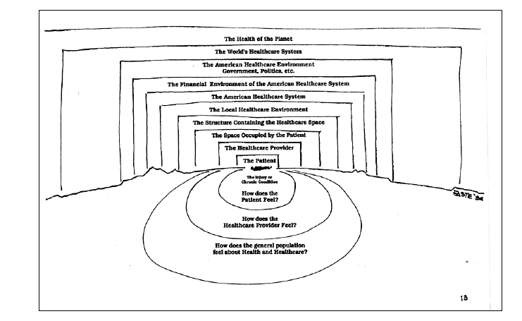 Powers of 10, also known as diverge/converge is important for the designer to:
Use, Usability and Meaning Organizing needs into categories or frames helps inform and inspire design. A useful framework:
Use the How?/Why? technique to create hierarchies of interconnected needs and to find relationships between higher level meaning needs and the usability needs you can design for directly. Remember to phrase your needs as verbs when you use this technique. 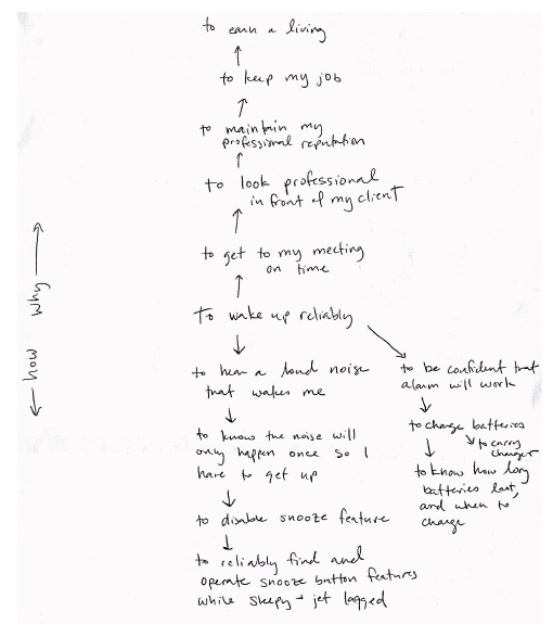 Timelines: Out of Box Experience One of the most straightforward timeline analyses that a designer can do is to map out what it’s like to interact with a product for the first time. Jim Adams, a Design Division professor emeritus, is one of the people credited with developing these so-called “Out of Box Experiences.” By simply photographing what it’s like to go through the experience of purchasing, opening and using a product, one can discover all sorts of successes and missed opportunities. It was this sort of study that led first computer companies to realize that people were bewildered by the experience of opening a computer box for the first time. One easy improvement was to include a small unintimidating card that said “Read Me First.” More sophisticated out of box experiences can be crafted to move beyond usability to a sense of meaning. Consider, for example, one fan website’s documentation of the ritual of opening an iPod shown below. One respondent likened it to opening a “modern day samurai sword.” Such a study doesn’t always have to be as thorough as this. Sometimes, a few quick sketches or cartoons in your logbook can help to reveal what’s really going on. 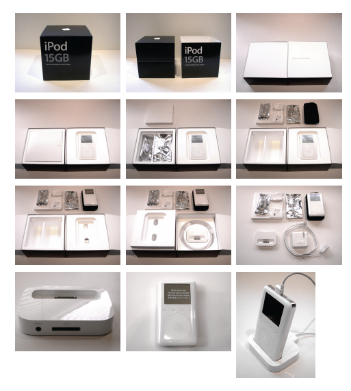 Timelines: Day in the Life One straightforward way to understand more about a person or group of people is to outline what happens to them during the course of a typical day. These Day in the Life studies help to convey a sense of what is routine behavior or “normal experience.” They help to provide rich contextual information as it maps over time. At their best, Day in the Life studies can help to reveal patterns, tensions or contradictions that might otherwise be overlooked if one didn’t compare one moment to another. A Day in the Life study can be as simple as a cartoon that you sketch in your logbook. It can also be as complex as a multi-layered document that includes both photos and detailed stories. Experts differ on whether it’s better to choose an actual day to describe or to create a composite out of many observations. One helpful rule of thumb: the less you know what you’re looking for, the more you want to stick to the factual data as it actually happened. 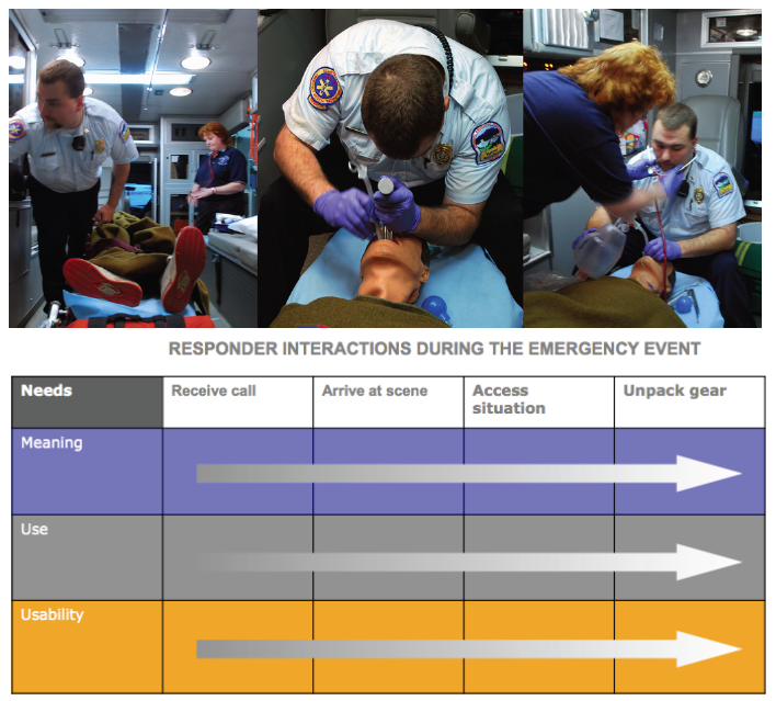 Timelines: Era Analysis If an Out of Box experience is one of the short time spans that you can analyze, an Era Analysis is one of the longest. When studying larger changes in a culture, it can be useful to track how a particular entity changed and developed over time. This can include:
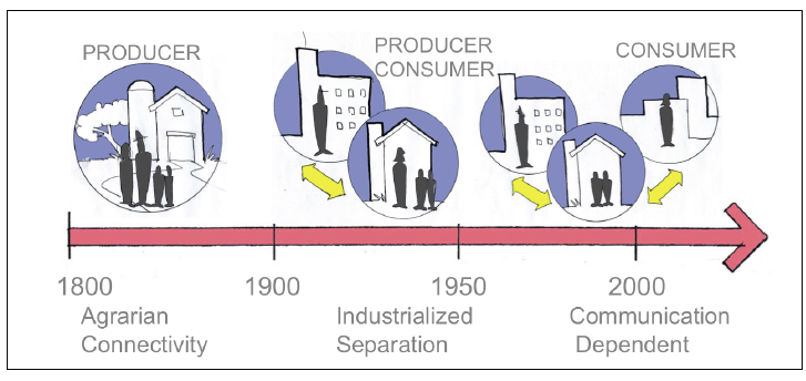 The types of Eras that can be examined are virtually limitless. In most cases, though, the goal isn’t just to describe how things were different at different times – it’s to identify why things were different and why they changed. That sort of “aha” usually occurs when you start to map many different types of elements to the same era. For instance, changes in fashion might coincide with changes in technology, and be reflected in changes in language choice for what something is called. Identifying those elements that seem to change together gets at least to correlation, if not causality. 2x2s Maps that organize disparate elements in a two by two matrix are a way to quickly understand the lay of the land. They can help show you where there are areas of intense of activity, as well as potential opportunity areas where nothing currently exists. Use matrices to organize and map the territory of potential users, observed behaviors, existing products, competing companies, new technologies, or even just relevant adjectives or descriptors. 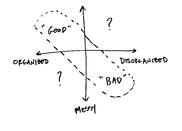 Steps for creating 2x2’s:
Design Principles are general strategies for solving a design problem, independent of the particular solution. Design Imperatives are the selected principles best suited to a specific design challenge. Design principles have long existed among architects, designers and engineers. They serve as heuristics –rules of thumb to tip off later generations about what seems to work. For instance, designers have long ascribed to the concept of the Golden Mean. The Golden Mean, or Golden Ratio, describes two segments, where the ratio of the short segment to the long segment is equal to the ratio of the long segment to the sum of both segments. Nautilus shells display this proportionality, as do the Parthenon, the Great Pyramid at Giza and Stonehenge. Renaissance designers such as DaVinci were captivated by the aesthetic beauty of the Golden Mean, and incorporated it into their own works. Even today, the iPhone uses the same proportions. It turns out that, at 2.125” by 3.375”, credit cards follow an even-rule approximation of the Golden Mean, too. It’s hard to say whether there’s something biologically attractive about this ratio, or if people just like it because they’ve seen it so often before. Either way, the Golden Mean is a one of many hundreds of generic design principles. Often, a set of generic design principles related to a specific topic, like user interface design, for example, is referred to as best practices for that field. If the best practices are well understood for the project on which you are working, you can refer to them in shorthand ways to summarize the usability imperatives for your solutions. For example, designers sometimes use the term “garden path” to encapsulate all the details of a design solution that prevent a user from activating a series of features that shuts down (or otherwise renders useless) the product by accident. The user is always kept on a safe “garden path” of interaction options. Design principles provide a basic understanding of how to design a wide variety of things. As a problem gets more complicated, however, we need more specific guidelines that are tailored to particular contexts. For instance, if you want to design a new family of power tools, it would be useful to have an understanding of what materials and forms convey a sense of ruggedness, durability or power. Of course, as you start to describe particular aspects of design, no single principle covers everything. What emerges is a system of design principles that all work together in a coherent way to reflect both an understanding of what the major needs of a system are, and the most effective way to solve those needs. We refer to this coherent set of principles as the design imperatives for a project. There are many resources for general design principles. Two of them are:
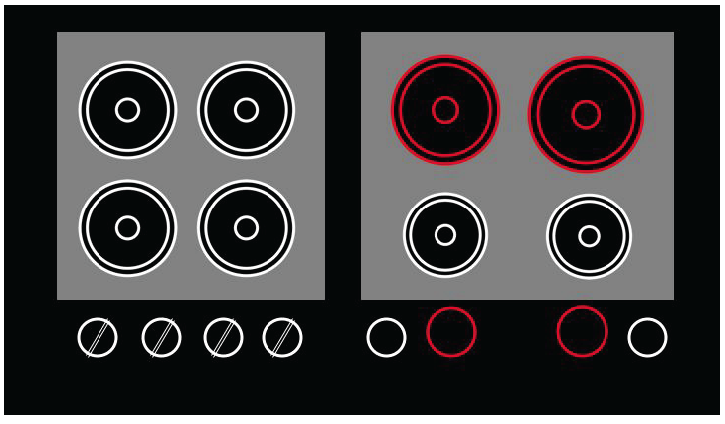 This illustration shows several generic design principles at work. The stove design on the right is easier to use because it follows best practices principles about how to make buttons and controls more intuitive.
Metaphors When people talk about their lives, we can listen to metaphors that they use in their stories and analyze them to discern how they frame their needs, their desires, and their dreams. As Lakoff and Johnson identified in Metaphors We Live By, there are basic metaphors that seem to describe how we see the world. These are conventional metaphors, called such because they describe cultural consensus about an idea. Becoming aware of conventional metaphors is like a fish discovering water – we’re swimming in them every day, whether we notice them or not. Indeed, some linguists argue that almost all language is metaphorical. Identifying shared metaphors can help to better understand how we, and those we study, see the world. Language makes extensive use of metaphors. For example:
Because metaphors encapsulate an idea, they can reveal, and at the same time conceal:
Metaphors come in many varieties. Structural: Matching the structure of one concept with another as with money and time.
Orienting: Associating direction with different aspects of things.
Personification: Turning other kinds of things into people.
Metonymy: Use of an attribute to substitute for a whole.
Metaphors are useful in Design Research! When trying to make sense of observations and things that you hear in the field, see if it’s possible to decode an underlying metaphor that recurs over and over in people’s descriptions. Then, through your analysis determine if an opportunity is created by using the metaphor, or by replacing it all together. Metaphors are also useful as a way to convey design imperatives to others. Sometimes holding the stories, imperatives, needs, and solutions in your head all at once is too much. A metaphor helps hold complex ideas in one chunk, rather than many little bits. For example, it’s easier to remember “a computer like a sunflower,” than “a computer with a stable base, an articulated arm, a screen that points many directions . . . etc.” Metaphors can help bridge uncomfortable topics, both in interviews and in your reports to clients and colleagues. It’s hard to talk about some topics directly. A metaphor can help an informant open up about a taboo topic, and it can get your point across in a closed-minded environment. It’s easier to talk about being “natural” than actually being unhygienic, and it’s easier to talk about hypothetical egos of stereotypical fighter pilots than the actual fragile egos in the room. |